Little Shotgun Remodel Reveal
Our second investment property, endearingly named Archie is FINALLY done. Come take a tour of it here!
FLIP HOUSE
2nd Flip House Reveal
DONE. FINITO. UNDER CONTRACT.
Archie is done.
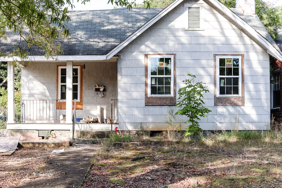
He’s come a long way and if you want to see how we started there’s an entire before tour of this investment property that you can see but it was ROUGH. I’m talking random pill bottles and an eerie elementary school type chair.

If you want to see just a glimpse of it – I mean holy moly.
I gave an updated tour of this shotgun house, with floor plan (aka. my shotgun shawty) in the updated walkthrough tour where you could get a better feel of the layout.
But now it’s completely done and I feel like I can breathe again.
(Except lol not really because we still haven’t finished this kitchen renovation we are in the middle of.)
If you’ve missed any of our other posts about this project, you can catch up on those here:
Exterior
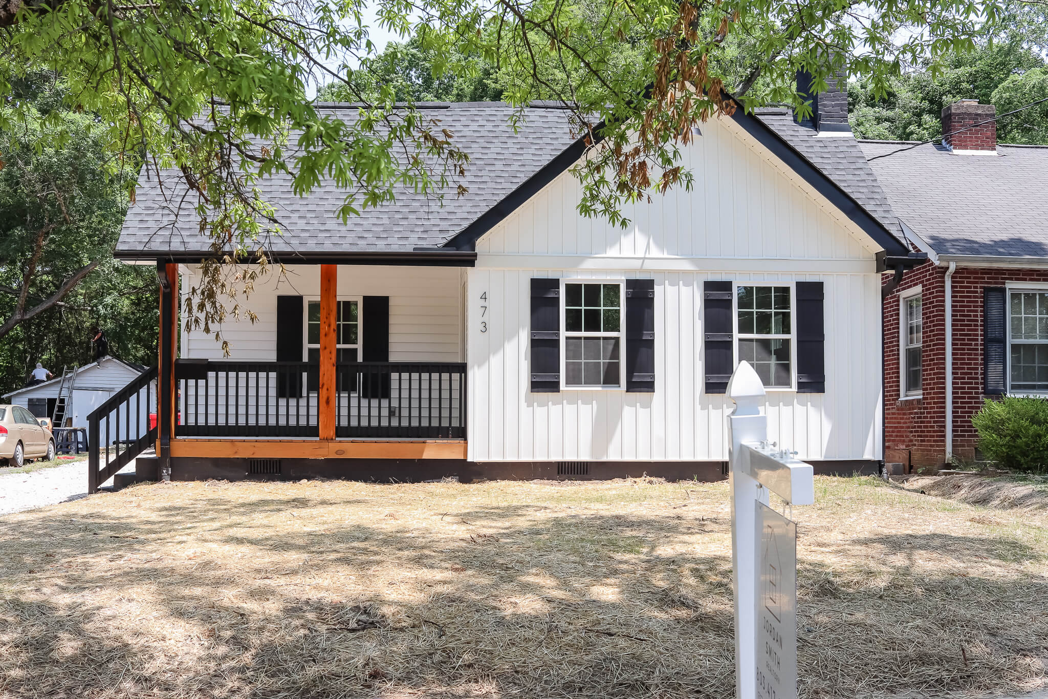
He was so sad on the outside. But we kept the same feel and just added some vertical board and batten, black shutters and a new sweet porch on the front.

I love the detail here of adding that sweet little black mailbox on the railing. If you’re not looking for it, it blends in which is a good thing, but then when you notice it, you’re just all “MEEP!” at its cuteness.

There was no deck on the back, but we loved the back yard and wanted the new homeowner to take advantage of it, so we added one here too for entertaining.

You may be asking what a shotgun house is but think of the opposite of a ranch.
In a ranch, you have the house wide from left to right where your living room/kitchen areas would be on, say, the left side and then your bedrooms would be on the right separated by a hallway.

In a shotgun house, everything is front to back. So the lot as well as the house is long and skinny.
It allows you to build vertical, but not so much horizontal in a shotgun house floor plan.
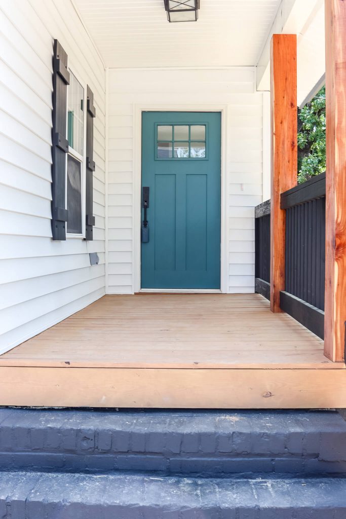
The front door color was something that we talked too much about, if you ask me.
We didn’t want black since everything else is black. We didn’t want pink because it felt polarizing.
I love the color we settled on here!
Interior
Living Room
During
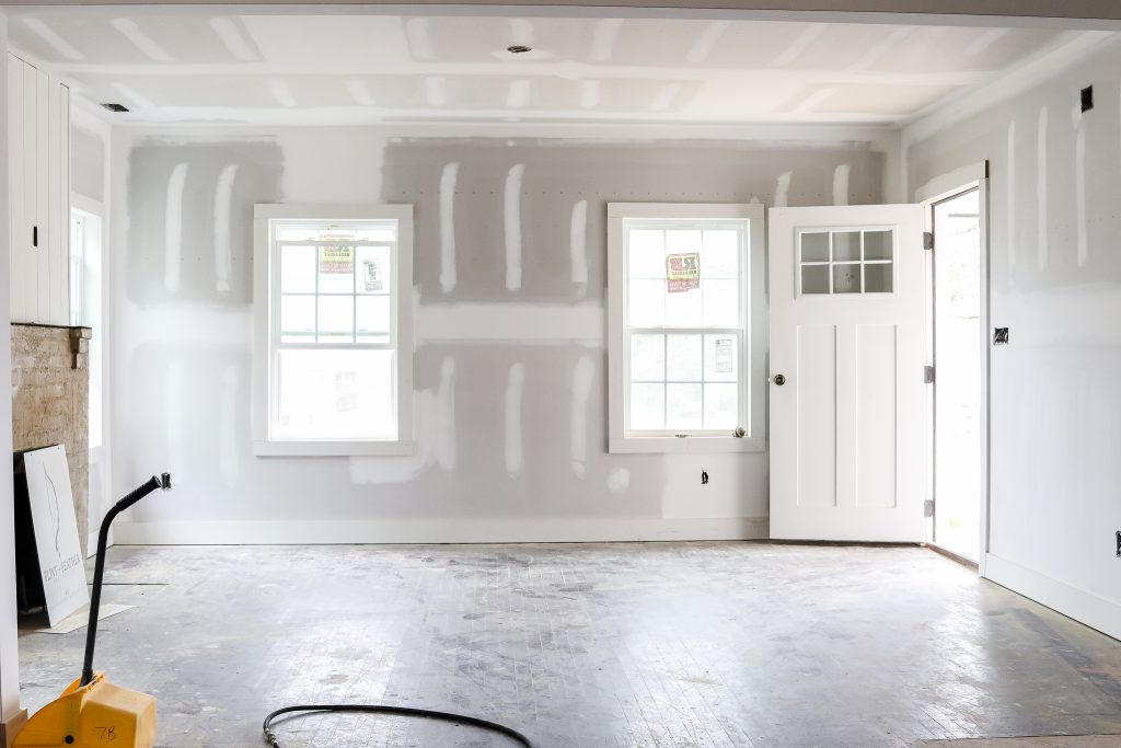
Once we had drywall and an actual door, the vision started to become more clear.
After

I love the open and airy feel of this space, even though it feels smaller than our first flip, Beverly.
Again, with a shotgun house floor plan, everything starts in the front and moves back so your layout of kitchen and living space is usually open.

We kept the fireplace, added a custom live edge mantle and painted it black. Are you surprised?
Oh, and wanna cry a bit?

This was little mama when I was taking photos for Beverly when it went on the market about a year ago.

And this is the same little mama who just turned a year old a week ago. I can’t believe it.
Dining Nook/Kitchen
Before

You can really get a feel for a shotgun style house floor plan here.
This photo is as if I were sitting on the couch in the living room. I can see straight out to the back door.
After

This is the same view, all dolled up.
The dining nook is much smaller in this house than it was Beverly, but I still love that you’re able to fit a round table with 4 chairs comfortably in this space.

It’s hard to capture the beauty of this kitchen but for it to be on the smaller side, it’s incredibly functional.
This was the first time we got to design a galley style kitchen and even though we have an island in our own new kitchen that I love, there’s something so charming about a galley kitchen.
Related: Read more about the 6 basic kitchen layouts

Again, smaller kitchen, but you have a good bit of countertops and food storage to work with here.
We have open shelves on both sides because it helped the space feel more open as opposed to having just a couple random upper cabinets.
With the floor plan of a shotgun house being long, working with that architecture and adding things like horizontal shiplap, horizontal drawer pulls and the open shelves helps make things feel cohesive.

We have to have a pot filler because it just makes you feel more fancy. It’s a must have in all our flips and we added one to our own home too.
This matte black modern vent hood has clean lines that looks great against the white shiplap backsplash.
Guest Bedrooms
Before

After
At first glance, these look like the exact same room, but in this house we had 2 guest bedrooms and you can see one is on the front of the house (you can see the railing of the front porch) and then the second is in the middle.
Simple. White walls, black fans that we have in our own house.
Hallway
Before

During

After

I mean, pictures do really say a thousand words, right?

Choosing to paint the end of this hallway black was the right move.
I actually lobbied to have it be fluted wood, but we have another place we are going to use that that I’m excited about.
Guest Bathroom

The guest bathroom sits right in between the 2 guest bedrooms.

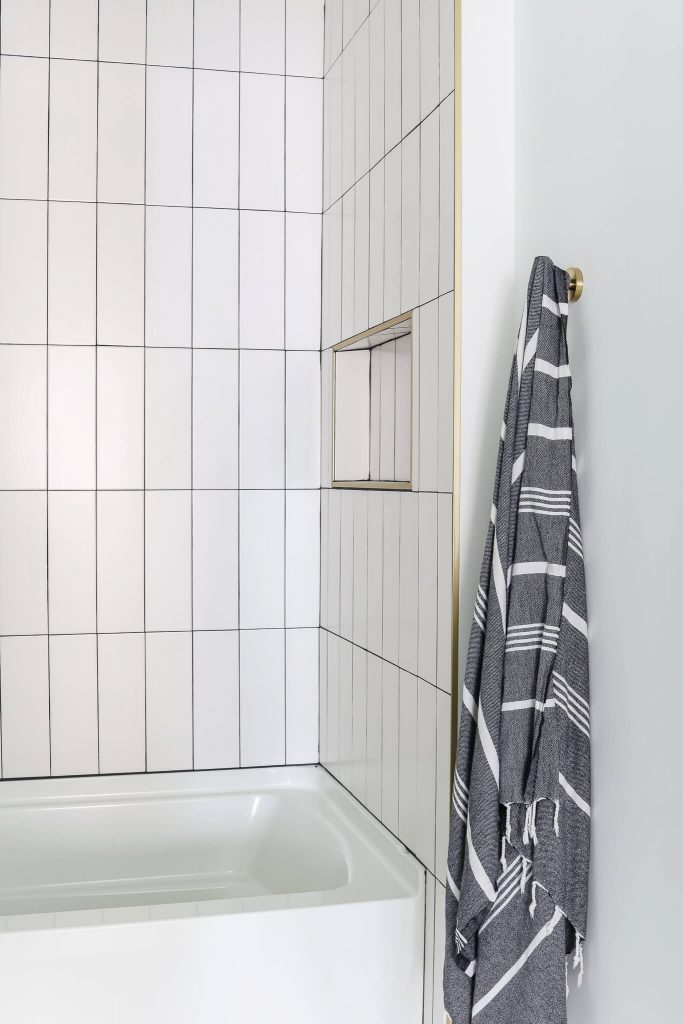
We went with a simple subway tile with black grout and brass fixtures to stand out.
Sometimes simple is the best, especially when you’re trying to flip a house and then leave the colors up to the new homeowner.

The bathrooms in here were smaller so we could only fit a single vanity, but this wood vanity with brass fixtures has a gorgeous modern style.

One more peek at the floors and we’re on to the primary bedroom which is my favorite.
Primary Bedroom

Thar she blows. I love it in here.
We were really hesitant about this room at first because there wasn’t the “perfect” spot for a bed.

You couldn’t put it to the left because of the closet and then immediately behind me is the wall with a barn door for your bathroom that wouldn’t fit a bed.
So we attempted this whole room board and batten and once staged, it was perfect.

I meannnnnn, I hate to brag but I also don’t hate to talk about how much hard work pays off.

Laying in the bed, here you see where the barn door is for the bathroom.
It’s hard to tell, but the glass is frosted so when you’re in there, there’s some privacy.

Speaking of someone who doesn’t care about privacy….Excuse me, ma’am, I’m trying to take a photo here.

Uh, ma’am, you’re still in my shot.

Okay, I can still see the top of your lil’ pony, but I’ll take it. Here’s the entrance to the primary bathroom.

I like to think that this room proves you can pack a whole lotta style in a small space.
This bathroom feels more masculine, especially when that LED vanity light is on, but I really like it.

We went with a large marble look tile in the shower to feel large and luxurious.
Simple white penny tile in the floor of the shower to make it feel as big as it can.

If these towels in here and the guest bathroom look familiar, it’s because they’re the same gray turkish towels that we have in our guest bathroom at home and they photograph super well, clearly.

Sleek black faucet, mirror and vanity light to round it out.
Other Details

Because of the shotgun house floor plan, it’s hard to fit in a mudroom/laundry room area like we did at Beverly.
Instead, we positioned this little bench right across from where a stackable washer and dryer can go.

It was very hard to capture in a photograph, but this sink had almost a sparkle to it in certain lights. It felt like it gave it some texture which I loved against the butcher block counters and the white shaker style cabinets.

Here it looks pretty plain, but I assure you it’s not.

The floors are not what we originally had planned, but I’ll tell you – I’m not mad about them at all. I love the look of these LVP floors and super pumped that we went with these!
Sources for the home
Much like with Beverly, we have a different approach than a normal post where I reveal a room and tell you all the sources.
I wanted to have a place where everything would live so I created a PDF design guide!

You can get this over 20 page design guide jam packed with every detail you need to know about this house, from paint colors to decor items for only $7!
Why did I do this? Why would I charge for this when so many others give away this information for free??
There was so much within the walls of this home that I wanted a more permanent place for it to live.
I also wanted to create a document that you could have on your computer or phone offline versus having to always come back to my site to get it, in case internet isn’t an option.
It’s all separated by room and every single item is listed by with the price and is linked so you can directly visit the proper place to view or purchase the item!
We have had a lot of people express interest in wanting us to help them flip a house because they’re not design minded and hiring us can cost you hundreds to thousands, depending on scope, but this little design guide can give you good guard rails to creating a space like this on your own for UNDER $10!
BUT!!!!
The people on my email list get first dibs on a discount code that will allow you to get this for only $4. But you’ll want to act fast because it’s only going to be the first 50 people to buy that get to use that code!


