Neutral Home Paint Colors – Sherwin Williams Agreeable Gray
Greige is coming back, especially when it comes to painting things that aren’t walls! Learn all about Sherwin Williams Agreeable Gray, including undertones, how we have used it in our home and where else you van use this beautiful neutral paint color!

PAINT COLORS:
Sherwin Williams Agreeable Gray (in our home and other real homes)
Fun fact: When we moved in this house, I made Jordan choose every paint color because I got overwhelmed.
He returned the favor by making me paint every single room in this house. It’s cute, right?
Although most of our house is Sherwin Williams Alabaster, we have a few rooms we decided to paint a more neutral greige and we went with Sherwin Williams Agreeable Gray.
Pottery Barn has chosen to showcase Agreeable Gray in their fall/winter collection for 2021 which means more people will be looking for this popular paint color and wanting to add it to their homes or freshen up their spaces that already have Agreeable Gray in it.
- What color is Agreeable Gray?
- What undertones does Sherwin Williams Agreeable Gray have?
- Is Agreeable Gray beige or grey?
- Where can you use this neutral paint color?
- Is Agreeable Gray still popular?
- Sherwin Williams Agreeable Gray Coordinating Colors
- Popular Color Comparison
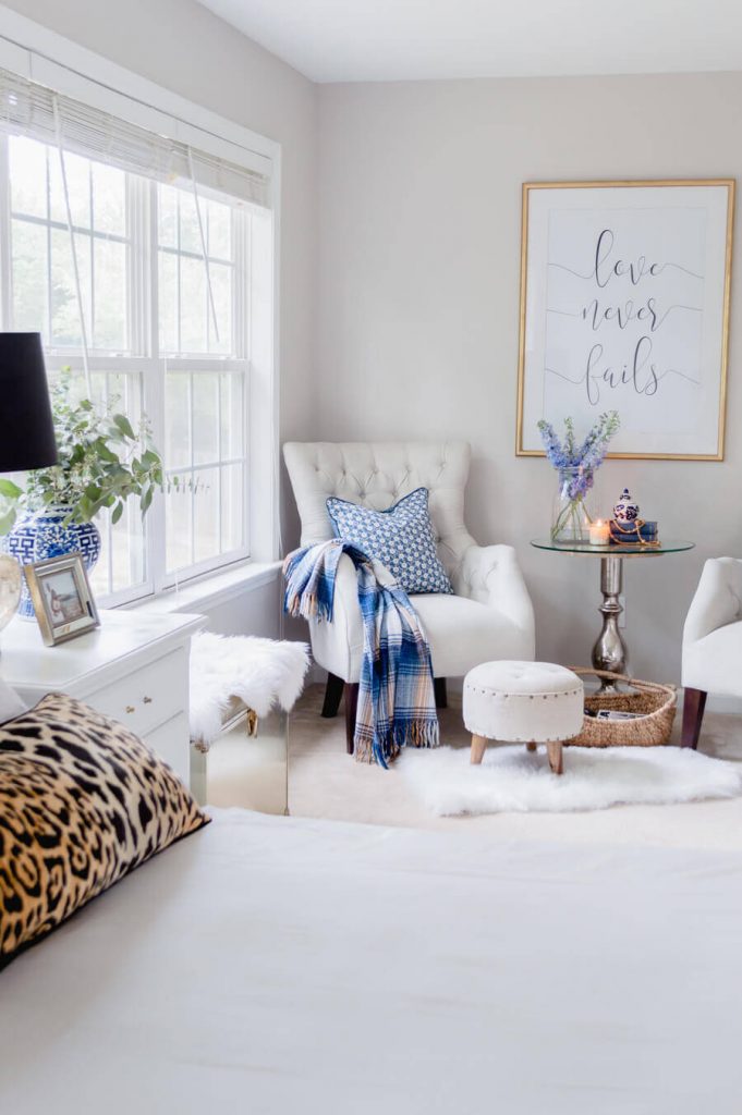
- Agreeable Gray in Real Spaces
- Trim Color Choices for Agreeable Gray
- Final Thoughts
- Don't want to paint a sample on your wall?
What color is Agreeable Gray?

Agreeable Gray is a light grey/beige color, even though people tend to associate greige with a more brown tone. This greige can lean way more gray in areas of natural lighting like our upstairs current guest room, but in our stairway which doesn’t get much natural light, it definitely feels more beige during certain parts of the day.
Agreeable Gray is a soft color, but it definitely leans darker than a “regular” gray like, say, Benjamin Moore Grey Owl which is what we have in our guest bathroom and our primary bathroom.
This greige paint color is an easy go-to because it can be paired with warmer (but not too warm) or cooler (not too cool) accessories.
All that said, this paint color is still greige which means you need to choose your other colors wisely. Agreeable Gray does take on some qualities of its surroundings so make sure it pairs well with your design.
In our current guest room, it doesn’t look too dark against the bedding because the tones of gray are so light and soft they don’t compete with each other. However, this color can be a little too much if paired with a really warm yellow.
What undertones does Sherwin Williams Agreeable Gray have?
Without a doubt, Agreeable Gray’s undertones are warm. It’s a beautiful color no matter how it looks, but I think the warmer undertones make this a more modern choice for neutral paint colors.
Like I said earlier, in our stairway which has hardly any natural light except for the top and the bottom of the stairs, this color really shows its warmer, brown undertones.
In our office and upstairs guest room which gets tons of natural light depending on the time of day, it leans way more gray and bright, but you can still tell that it has those warm undertones.

However, I love using greiges in both warm and cool “settings” because you don’t have to worry about going too far either way with this color.
Is Agreeable Gray beige or grey?
Well my friend, I’m so glad you asked. The answer is yes. Ha. It’s both! I know you were thinking it too. It’s why they call it greige. Grey + beige.
It’s truly amazing how much gray is in this color while still having the warmer, beige undertones and we love the neutral tones for our home since we all know ya girl is scared of color.
In an entryway or a hallway that you really want to pop but don’t want to go the traditional route, Agreeable Gray is a beautiful alternative.
Where can you use this neutral paint color?
Agreeable Gray is a versatile dark or light grey/beige that can be used in many places. Here are some ideas of where you can use this paint color:
- Hallways and bedrooms
- As an accent wall in just about any room of your home
- Bathrooms
- Kitchens
- Living spaces
- Entryways
Is Agreeable Gray still popular?
Yes! Here’s how I can promise you that it is:
Pottery Barn just added it all over their winter catalog. Which means people who were not into it or who had fallen out of love are going to have that love rekindled here shortly.
Sherwin Williams Agreeable Gray Coordinating Colors
Being the light grey/beige that it is, Agreeable Gray pairs great with light and dark neutrals alike. Think gray, blue, green, white and brown.
I’ve definitely seen this color look gorgeous with blue and green and I think that’s because it doesn’t lean too beige or gray. For instance, if you had a room painted in Sherwin Williams Agreeable Gray and paired it with an emerald green sofa with dark brown legs, it would be *chefs kiss*
(I’ve been pining after an emerald green velvet sofa but children).

Alternatively, if you pair this gray color with a lighter sofa like our Ikea Ektorp sofa and love seat, it’s a subtle pop that doesn’t compete but adds depth to the space.
This is why I think Agreeable Gray is such a beautiful color because it can be used as an accent or as the main wall and if paired with your decor, will look gorgeous either way.
If you want to get away from the traditional pairing of just “gray and brown” or “gray and blue”, try some of these colors instead:
1. Sherwin Williams Iron Ore

I wouldn’t consider Iron Ore a true black, but with it’s super deep hue, I feel that using Iron Ore can help Agreeable Gray appear more gray than greige. I think out of all the spaces in our home that use this color, our office feels the most “gray” rather than “greige”.
2. Sherwin Williams Sea Salt

We have used this color in our playroom which actually sits right outside our office. It’s always a seamless and smooth transition visually from one room to the next, with the rooms being divided by our glass french doors that I painted Sherwin Williams Iron Ore.
Sherwin Williams Naval
We used this color as a diagonal feature wall in Charlotte’s room until we made it over for both the girls’ shared room. Deeper hues pair well with Agreeable Gray because of its warm undertones. It adds a sense of richness and depth to the space.
Sherwin Williams Storm Cloud

A color we used for our hallway, Storm Cloud could work great at pulling Agreeable Gray into more of its gray-ness. Since Storm Cloud is technically a cooler color, pairing this with a warm color could work as long as you have natural light.
I wouldn’t do this in a dark stairway or hallway like ours, but in an area that gets natural light for most of the day this could be a great option.
Popular Color Comparison
Agreeable Gray vs. Benjamin Moore Revere Pewter
Arguably one of the most popular greige paint colors from Benjamin Moore, Revere Pewter is another greige color with a hint of warmth in the undertone.

Revere Pewter is much darker and richer greige, whereas Agreeable Gray has a lighter airiness to it. Agreeable Gray has an LRV of 60 and Benjamin Moore Revere Pewter is 55.
Remember: When it comes to LRV, or light reflective value, the closer a number is to 0, the closer it is to black. The closer a number is to 100, the closer it is to white.
Higher numbers on the LRV scale reflect more light. Lower numbers on the LRV scale reflect less light.

I made a lil’ baby graphic here to demonstrate, but let me tell you something – I am not a graphic artist so this is nothing fancy.
Agreeable Gray in Real Spaces
Bedroom
Living Room
Kitchen
Bathroom
Cabinets

Trim Color Choices for Agreeable Gray
When choosing a trim color to pair with Agreeable Gray, you need to be a bit cautious. Because Agreeable Gray is greige and not a true grey or beige, you need to take heed of those brown undertones and make sure that you choose a very true, very bright white.
I wrote a post all about how to choose the best white paint colors for trim if you’re interested in seeing that, but for now, here are some great options for Sherwin Williams Agreeable Gray trim color options:
Sherwin Williams Extra White:

In our own home, all of our trim is Sherwin Williams Extra White. Extra White is also the color of our upper kitchen cabinets as well. This white is a very bright white, but doesn’t feel too cool or sterile.
Sherwin Williams Pure White:

In our first flip house, we used Sherwin Williams Pure White and it’s stunning. It feels very white and pure, but it also has a warmer undertone than Extra White and still feels really white against the greige of Agreeable Gray without looking too cream or beige.
Final Thoughts
Agreeable Gray is a great choice for any room in your house. You can find the perfect color to coordinate with it and you will be able to use all of our favorite colors when picking out trim, cabinets, flooring and more!
I’m not mad about adding the color to our home and I can see us adding this to any flip houses we may do in the future as well. Who knows?
Agreeable Gray is here to stay and I’m not mad about it.

The fact that this color works in so many lighting situations is what makes it really “agreeable”.
As always, please please don’t be that person that gets mad at me on Pinterest or whatever because “these colors are off than what they are in real life.”
Of course they are. I’m on an electronic device. You’re on an electronic device. Depending on what light settings you have on your phone or computer, it’s going to look entirely different and nothing like it will in real life.
That’s why I tried to include images of the color in real homes as well as the disclaimer to tell you to ALWAYS make sure you test a sample of the paint in your own home because you will never know how the color will read – especially a chameleon color like Agreeable Gray which can read gray or beige.
Don’t want to paint a sample on your wall?
Have you ever heard of Samplize? They offer giant peel and stick samples of paint swatches you can add to your wall so you can spend a little bit of money once instead of a lot of money on multiple samples.
You can try Samplize here if you’re looking at any paint colors from Sherwin Williams, PPG, Benjamin Moore or Farrow & Ball.
And thus concludes the most riveting paint color post this side of the Mississippi (whatever side you may be on).


